Wednesday, May 10, 2017

Flying a Trimble UX5 and DJI M 600

Trimble UX5

The day started by launching a UX5 to collect imagery over a wetland. 

Flight Height: 400 ft
Flight Time: 39 minutes
Flight Speed: ~55 mph
Sensor: Sony A5100

Figure 1: Image of Trimble UX5 in it's carrying case.


Figure 2: UX5 about to launch.


Figure 3: Trimble UX5 launching.


DJI M 600


The second flight was using a DJI M 600 to help get imagery to delineate a certain part of the wetland better.


Figure 4: Dr. Joe Hupy and the M 600 preparing to launch.


Figure 5: Image of the taken M600 in mid take off.


M600 Flight Over Eau Claire South Middle School Gardens

Introduction

The Geography 390 class took a trip to the South Middle School gardens to apply techniques learned throughout the semester to fly UAS. The first flight was done with a DJI Phantom Advance system, and captured imagery of just the garden. The second flight captured oblique imagery of the cars driven to the garden by students by a DJI Inspire. The third flight was done with a M600 UAS and captured imagery of the garden, field, and the surrounding areas. This third flight is what the rest of the lab is completed off of. This lab was designed to get students hands on experience flying drones, and seeing the process of imagery collection from start to completion.

Figure 1: DJI Phantom Advance and Topcon Survey GPS unit.


Methods

The resulting map is created using the process described in this blog post from earlier on in the semester.

Figure 2: Abe and Nathaniel setting up the GPS over a GCP.

Figure 3: DJI Inspire in the distance.

Results

Figure 4: Map resulting from data collection.

Processing Obliques Imagery Using Image Annotation

Introduction

UAS imagery can be collected from a variety of different aspects. One of the most common forms is called NADIR collection. Another technique, which this lab will be focused on is called oblique image collection. Oblique images are any images that have been collected at an angle. In Pix4D, these images can be used for 3D modeling of objects. This is due to the angular collection being able to visualize an object from all sides. Figure 1 displays the 3D Model option within Pix4D and gives options for creation, such as sculptures, urban modeling, and video fly-by of scenes.


Figure 1: Pix4D description of 3D modeling.

Methods

This lab includes three different sets of data for 3D Modeling. Prior labs in Geography 390 have all focused on processing data through the 3D Map template, but due to the nature of oblique imagery, the 3D Model processing option will be utilized. The use of 3D Modeling disregards the creation of the DSM and orthomosaics. The flight plan sets up the UAV to fly in a corkscrew manner around the object to model in order to capture all of the ins and outs of the thing to be modeled. The three sets of data include models of  a bulldozer on the Litchfield mine site, a shed at the South Middle School in Eau Claire, and a pickup at the same location. Another important aspect of 3D Modeling is the use of annotations. This is done within Pix4D, and removes all objects which obstruct the creation of a 3D model. This can include the sky, bare ground, grass, etc.. Completing this allows the final model to represent the nature of the subject.

The first step is to run the initial processing for each data set. This allows the ray cloud to be completed, and gives a camera view for each image location. From here, one is able to use the annotation tool to select everything in the image that is not a part of the subject (Figures 1, 2, 3). The mask tool is used to complete this to turn everything in the images not a part of the subject pink. This process is completed for 4-5 images within each data set to train the program to catch all overlap in modeling. Once the annotation is complete on the set of images chosen, the re-optimize and Point Cloud and Mesh Processing option is ran to create the actual model of the object.


Figure 2: Completed annotation of the bulldozer image set.


Figure 3: Completed annotation of the South Middle School shed.


Figure 4: Completed annotation of a Toyota Tundra.


Results

The results show mixed success. The data sets create a model, however for cases such as the shed (Figure 6), the results are less than ideal still. Even with the annotation completed. there is still a large amount of floating pixels that schew the success of the image. One can also see within Figure 6 what the results of annotation is intended to remove. Within the trees, the sky is meshed into the branches, and thus creates inaccurate, and poor quality results. The annotation is done to remove these from the subject.


The bulldozer results are fairly clean (Figure 3). There is little to no distortion of the bulldozer after completing the annotation. This could be attributed to the images having little to no sky in the background. The sky can be the biggest creator of distortion among images.


Figure 5: Flyby view of the bulldozer (click to load).


The shed's modeling results are less successful than the bulldozer. The sky could have played a huge role in this. There are floating pixels everywhere throughout the image and the model has some distortion along the roofline (Figure 6). As stated earlier, the potential distortion caused by the sky can be seen within the trees, and this is why annotation is completed to eliminate that form the subject matter.


Figure 6: Flyby view of the South Middle School shed (click to load).


The truck's modeling results are more successful than the previous two renders (Figure 7). The model is accurate, and there is little distortion, sans some underneath the bed. This result could be due to the flight's oblique angle. It is focused downwards at the truck for the whole flight, so there is far less noise interfering the image from background objects.


Figure 7: Flyby view of the Toyota Tundra model.


Conclusion


The 3D Models created using oblique imagery has mixed success. Subjects that are close to the ground, and show little sky in the background tend to be more successful in removing distortion. Another aspect of this is the decided flight path of the UAS. Choosing the right flight can eliminate much of the potential problems that could rise up through the results when brought back to process. This process could be very useful for urban modeling, sculpture modeling, and any other consulting project which requires accurate imagery of fine-temporal data. Due to the high amount of time taken to complete the annotations for each image set compared to the accuracy of the results, this process would not be valuable to complete unless the results needed extreme accuracy, such as survey fly-bys.


Friday, April 7, 2017

Calculating Volumes of Mine Piles Using Pix4D and ArcMap

Introduction

Volumetric analysis is incredibly important to mining operations. Utilizing UAS technology to assess mine pile volumes is both cost effective and efficient. Having more frequent volume analysis on mine operation's stockpiles would allow companies to save money, while improving overall business. This lab's intention is to provide an example of how valuable UAS data is in assessing volumes of piles at Litchfield mine. There are three piles that will be assessed both in Pix4D and ESRI's ArcMap using a variety of volumetric analysis.

Methods

In Pix4D, the first step is to open merged mine flight project from earlier assignments. This project already has GCPs added, so the spatial analysis will be highly accurate. Three new volume objects are added to the imagery around different piles. Once this is done, the volumes are calculated by simply pressing calculate (Figure 1).

Figure 1: The three objects are displayed with numbers corresponding to the volumes on the left.


The next volumetric analysis is done within ArcMap. The first step is to bring the DSM of the merged litchfield project into ArcMap. Once this is done, a geodatabase is made, and three polygon features are created within the gdb around the three piles that were analyzed in Pix4D (Figure 1).


Figure 2: This image is the DSM hillshaded in ArcMap 


The next step is to use the split raster tool in ArcMap. Running it three times, and using the polygon features created around the piles splits the DSM of the mine into the three piles analysed in this project (Figure 3). 


Figure 4: This image is the result of the split raster tool, taking the shapes of the polygons out of the DSM.


The next step is to use the surface volume tool, which takes an elevation and either measures the volume within the raster either above or below that point. Within this exercise, the above function is used, and the proper elevation to be input is collected using the information tool. The DSMs are then converted to TIN, and the surface volume tool is used for collecting the volume of these rasters as well.


Results


The DSM piles all were at different elevations, and because of this the different times the surface volume tool ran, the above E elevation had to be changed.


Figure 5: The DSM piles are displayed here in map form. These piles were used for volumetrics.


Like the DSM piles, the TIN piles all were at different elevations when analysed, and because of this the different times the surface volume tool ran, the above E elevation had to be changed. 


Figure 6: The piles in TIN raster form are displayed above. These piles were used for volumetrics.


Discussion


Table 1: The different volumes collected. AM stands for processed ran in ArcMap.


The table above displays the volume calculations from the different processes used in this exercise. From viewing this table, it appears that Pix4D is the best program to run volumetrics. As one can see in Figure 1, the "E" elevation provided in Pix4D moves with the surface, and provides a highly accurate consistent elevation which the volumes are calculated off of. This is especially evident in Pile 3. Pix4D's calculated volume looks much more realistic to the small size of the piles than the ones provided through ArcMap.

Another thing that can be noted is the inaccuracy of TIN. Although both rasters are much less accurate than the volumes provided by Pix4D, the TIN is created using interpolation, so it essentially "fills" in the different variations in elevation within each mine. This creates much more inaccurate readings if a company is trying to get true evaluations of their mine's volumes.


Conclusion

Volumetrics are incredibly important to the business of mining, as well as other professions. This assignment shows that every process is different in assessing true volumes, but true dedicated UAS software seem to outperform mapping programs. Pix4D performed far better than the tools ran in ArcMap. If one needs to get fast volumes without a need for accuracy, things like ArcMap can do well, but if programs like Pix4D are available, it is worth using. It can save time, money, and manpower.


Sunday, April 2, 2017

Processing Multi-spectral UAS Imagery

Introduction

Red edge sensor systems capture imagery within multiple bands in the electromagnetic spectrum (EM). Most images people are used to seeing are captured within the visible light portion of the spectrum, and include the blue, green and red bands (rgb) of the EM spectrum. Each sensor within a rededge system collects imagery within one band on the EM spectrum. Sensors such as the MicaSense RedEdge Sensor captures imagery in 5 bands of the EM spectrum and combine the images in a spectral alignment. The bands utilized in a rededge sensor include blue, green, red, red edge, and near infrared (NIR). Combining different bands other than the common rgb alignment allows users to view different aspects of the surface properties within the image. A false color infrared image uses the NIR, red, and green bands to view the health of vegetation as depicted by darker reds. The false color rededge combination includes the NIR, rededge, and green bands to view the Normalized Difference Vegetation Index (NDVI). The NDVI can be used to identify different aspects of the image such as the health of the vegetation in greener colors, and bare ground spots in the more yellow areas. Information such as this can be used in various professions such as mine remediation to determine where vegetation is coming back stronger.

Methods

Processing

The images had to be processed with Pix4D to start. There are a few different settings with the multi-spectral imagery. First, the procssing template was set to Ag-Multispectral. The GeoTiff and GeoTiff without transparency were also checked in the processing options. The initial processing produced the quality report. The report showed that only 69% of the imagery became calibrated (Figure 1). After closer inspection, this is due to the sensor collecting images on both the take off and landing, disrupting proper collection. 


Figure 1: First page of the quality report generated from the initial processing displays a slew of information, including the calibration percentage (69%).


After the quality report is generated, the imagery can be further processed. 

Creating a Composite Image

Generating a composite image allows users to view different band combinations of the study area. This is done in ArcMap using the composite bands tool. The bands are placed into the tool in order of EM wavelength size: blue, green, red, rededge, and NIR. This creates a map with distinct band options to create false color images such as infrared and rededge. 

Classifying Imagery as Pervious or Impervious

The next step is to classify the surfaces in the images as either pervious or impervious. The Calculating Impervious Surface lab can be consulted for this, as the process is very similar to that. The composite image is used in the Segment Mean Shift tool in ArcMap (Figure 2). This process allows users to create an image of like surfaces to aid in classifying the image. The segment mean shift created an output that was inaccurate as one can see in the center of the image. There are two different colors for the house's roof. This is due to not calibrating the sensor before the flight take-off which caused discoloration in some areas of the image.

Figure 2: The results of segment mean shifting the image.

After the image was segment mean shifted, the Training Sample Manager is used to aid in classifying the surface properties. Creating different samples across the imagery and combing the samples allows the user to create an image of distinct classified surfaces (Figure 3).


Figure 3: Different samples input into the training sample manager.
 
Once all of the samples have been added, the Classify Raster tool utilizes the training sample to apply the apply the surface classification to the imagery. After this is done, the surface types were combined based off of either pervious or impervious characteristics.

Results/ Discussions

RGB

The red, green, blue combination uses the visible light bands of the composite to create a RGB image of the visible light (Figure 4). As one can note, the road, and other areas of the surface look tinted red, which is a result of the un-calibrated sensor noted above. This image shows the distinct areas throughout the image. There is the house in the center, the road and driveway on the left side of the image, and dense vegetation on the right side of the image.


Figure 4: RGB band combination shows imagery above.


False Color IR

The false color infrared image uses a band combination of NIR, Red, and Green to create an image (Figure 5). This type of image is used to denote vegetation health. The healthier vegetation is a darker shade of red, and the impervious areas become a shade of blue. The map below shows how the vegetation surrounding the house is healthier than the vegetation further away. The trees to the east, and the shrubs to the north also appear to be healthy.


Figure 5: Map displaying the false color IR properties.


False Color RE

The false color red edge image uses the following band combination: Red Edge, Red, Green. It is very similar to the fasle color IR in determining the vegetation health (Figure 6). It is also know as the NDVI. The colors of vegetation health are more dramatically different than the false color IR above, allowing users to see the differences in vegetation health much easier.

Figure 6: Map displaying the red edge NDVI imagery of the study area.


Surface Type

The surface type map displays the classified imagery throughout the whole study area (Figure 7). This is done before grouping these types together based on pervious or impervious properties.Seeing this, one can note that the uncalibrating of the sensor played a massive role in creating an inaccurate combination image. The field on the far west side of the image one can see in figures 4-6 is denoted as "House" in this image among other misclassifications.

Figure 7: Map displaying the different surface types of the study area.


Surface Properties

The last image displays the pervious and impervious surfaces throughout the study area (Figure 8). Pervious surfaces are any that can be penetrated by water and other liquids. This includes, grass, vegetation, and bare-ground. Impervious surfaces are any that do not allow water or other liquids to pass through. This includes things such as buildings, pavement, rocks, and metals. As noted before, there are inaccurate classifications, but aside from the western field and the house's western side, it paints a pretty good image of what the surface types of the area are.

Figure 8: Map denoting the pervious and impervious surfaces of the study area in Fall Creek.


Conclusion


Using value added data analysis on UAS imagery allows users to gather results that demonstrate the robust usage of UAS data among various professional fields. 

Monday, March 13, 2017

Processing Pix4D Imagery with GCPs

Ground Control Points (GCPs)

  • What is a ground control point?
A ground control point (GCP) is a set point whose coordinates are known in a given coordinate system.

  • What are GCPs used for?
GCPs are used to georeference a project. The known point's coordinates are tied down to the visual GCPs in the project to reduce the x,y,z positional error of the captured images.

  • What will GCPs be used for in this project?
GCPs in Litchfield Mine have been pre-set and their coordinates have been collected with a survey grade GPS. These coordinates will be imported into Pix4D to georeference the images, and increase the accuracy of the project. The results of this project will be compared to the previous Litchfield Mine project which was completed without the use of GCPs.


Methods

In a new project in Pix4D, the images from the first flight are brought in, and the camera's shutter mode is changed to Linear Rolling Shutter. The field collected GCP coordinates located within a text are imported to the project after this. The settings must be set to Y, X, Z as the text file is formated this way. Once this is done, the Initial Processing can be run.


The DJI Platform the images were collected with has a problem arise which produces significant issues with altitude of the GCPs. The GCPs have to be edited within either the Ray Cloud Editor or the Basic Editor to correct the errors brought on by this (Figure 1). 


Figure 1: The editor options within Pix4D must be consulted when using a DJI Platform.


Once the Editor of choice is selected, the field notes of where each GCP is located must be consulted to place the GCP in the correct place (Figure 2). The Basic Editor is used in this project. The location from the notes is zoomed into in the Basic Editor to find the proper GCP (Figure 2). When it is located, the x is moved to the very center to ensure accuracy.


Figure 2: The overview of the Basic Editor. The yellow x marks where the GCPs were imported to. 


After the GCPs are corrected, the project can be reoptimized. Once this is done, the GCP Manager can be utilized to access the Ray Cloud Editor. The same process of zooming into the GCP and moving the yellow x from the Basic Editor is done within the Ray Cloud Editor. For each GCP, this is done for at least 5 images, and then apply this to adjust the GCPs. This is done for all of the GCPs for this flight. After this, the second and third steps of the processing are run to complete the project. Once the first flights images are processed, the same process of these steps are completed for the second flight too.


Figure 3 shows the first step of the next process. A new project is created which merges the two flights from Litchfield Mine together. The GCPs are imported to tie the project down again.


Figure 3: This figure displays the selection 


After the Initial Processing is ran, the Basic Editor is used again to ensure the GCP accuracy (Figure 4). This step is important when merging two projects together to make sure that they stitch together properly.

Figure 4: The Basic Editor correcting the GCPs of the two projects when merged.


Figure 5 displays the imagery in the Ray Cloud with the triangles computed. When this step is reached the GCPs are visible on the surface.

Figure 5: The two projects stitched together displayed with the triangles computed. 

Results


The results of the processing with GCPs are clear compared to projects that don't include GCPs. 
Figure 6 shows the merged DSM of Litchfield Mine, compared to Figure 7 which did not include GCPs. The results from the GCPs reduce the noise of the image. Figure 6's results show a higher visual accuracy compared to Figure 7.


Figure 6: DSM completed from merging the two projects together.


Figure 7: Results of processing Flight 1 with no GCPs.


Figure 8 displays the results of the merged orthomosaics. The variations in altitude are much more visible in the merged project compared to the second flight (Flight 9). Although Figure 8 includes both flights in the project, the two can still be compared. When compared as layers, the project which includes GCPs is clearly more accurate.


Figure 8: Orthomosaic of the two projects merged together.


Figure 9: Litchfield Mine Flight 2 displays the results of not using GCPs.


GCPs Revisited


The results of using GCPs are more accurate than not using them. Pix4Ds GCP integration is a very streamlined process that allows users to include GCPs with ease and creates better imagery.

Thursday, March 2, 2017

Calculating Impervious Surface Area

This activity is based on the Learn ArcGIS lesson: Calculate Impervious Surfaces from Spectral Imagery. It utilizes AcrGIS Pro to familiarize users with Value Added Data Analysis. This lesson uses aerial imagery, like that collected with UAS, to classify surface types. It ultimately creates a layer that describes that impervious surfaces of a study area.


Methods

The data used is available from the lesson.


Segment the imagery


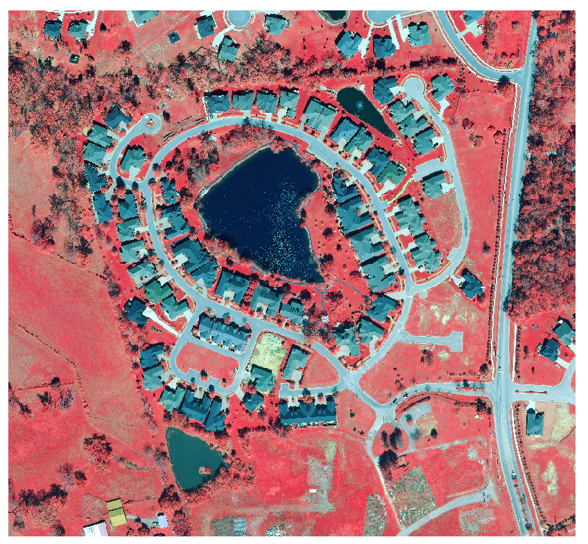
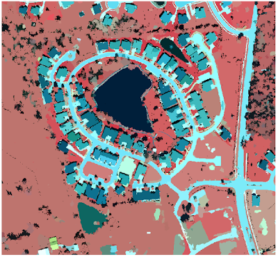
Users open up the existing Surface Impervious project first. The "Calculate Surface Imperviousness" tasks are used in this lesson.  The first step is to extract the bands to create a new layer (Figure 1).


Figure 1: Bands 4 1 3 are extracted to create a layer such as the image above.


The next step is to group similar pixels into segments of image using the "Segment Mean Shift" Task. The parameters of Figure 2 are filled into the task to create a new layer (Figure 3).


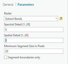
Figure 2: Parameters used to create a segment mean shifted layer. 


Figure 3: Result layer of the segment mean shift task. The pixels that are alike are grouped together.


Classify the imagery

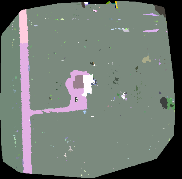
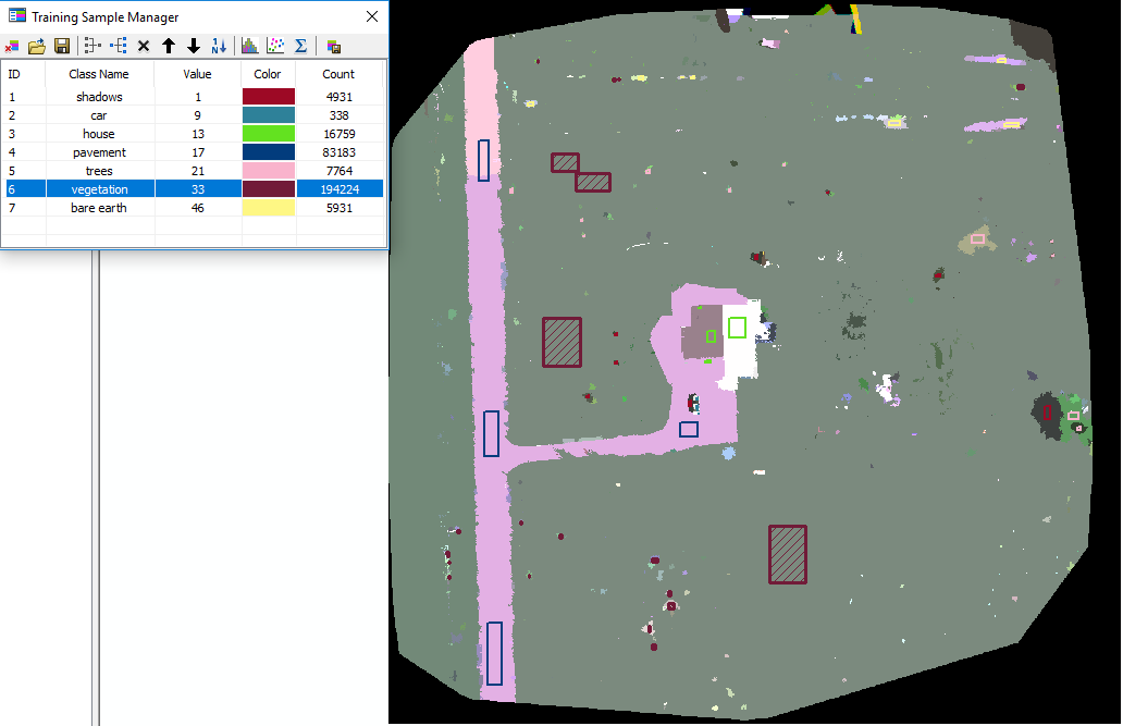
The last section segmented the image to makes classification easier. This section classifies all of the different pervious and impervious surface types into distinct categories. Figure 4 shows many different segments of the image classified into 7 classes. All of the samples are grouped into like classes such as: gray roofs, water, roads, driveways, grass, bare earth, and shadows.


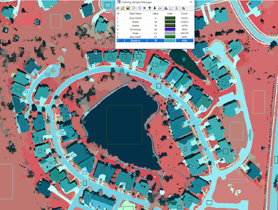
Figure 4: Different spectral classes help to distinguish pervious and impervious surfaces.


The classification samples are then saved as an individual file to use in training the classifier. The neighborhood raster is compared against the sample file to create a classified image (Figure 5).


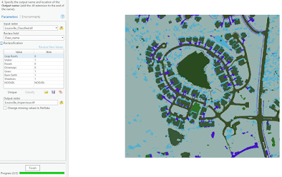
Figure 5: The study neighborhood classified into the seven different classes. The left column shows the parameters for the next step completed

After the image is classified, a field is added to further classify the image into pervious and impervious classes as either 0 or 1 (Figure 5). The task is run to create an output of either pervious or impervious surfaces (Figure 6).


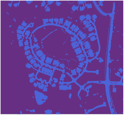
Figure 6: The dark purple segments are all pervious surfaces, while the impervious surfaces are all light purple. 


Calculate the impervious surface area


One-hundred accuracy points are created using an equalized stratified random process. The first ten of the points are analyzed and classified based upon the surface type they lie upon (Figure 7). The task is run to create a table which can be used in the lesson.

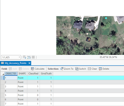
Figure 7: The highlighted point is classified into 1 for pervious or 0 for impervious surface type.

A confusion matrix is used in the next step. This computes the accuracy between the classification and the accuracy assessment tasks. If both are classified as impervious, then the matrix will have a high percentage (Figure 8). The next step runs a tabulate area process on the parcels to assess the imperviousness level within each one.


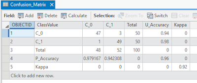
Figure 8: Confusion Matrix. U_Accuracy is user accuracy, P_Accuracy is producer accuracy, and Kappa is the final computed percentage overall.

The final step of the lessons is the join the Impervious Area table (Figure 9) with the parcel table to symbolize the parcels based upon the different levels of imperviousness.

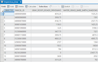
Figure 9: The tabulated area table of imperviousness within each parcel.


Results


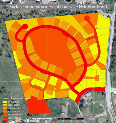
Figure 10: The final result of the surface imperviousness tasks ran through the lesson. The darker the shade, the more impervious surface within that parcel.

The final results were very successful. The map that I was able to make in the lesson imitates the real impervious levels within the initial raster image very well. The roads are the best example of this. Every single black top displays on the map as extremely dark red. The grass is the most pervious, and is displayed as the lightest yellow.

Some difficulties encountered in this activity were all the result of ArcGIS Pro. It is extremely difficult to make a layout in ArcGIS pro. I couldn't figure out how to change the units on the scale bar, change the decimals on the legend, or even export it as a jpeg. The ESRI help was little help at this point too. I ended up printing the image to a pdf, and going into Adobe Illustrator to manually change the units from kilometers to meters and I was able to export as a jpeg there.


Conclusion


ArcGIS Pro is a very robust software program that can run Value Added Data Analysis very well. It is the future of ESRI, and they have been slowly rolling it out. It is still being improved, so within the next few years, it should run as smooth as the current ArcMap. The resulting map for the lesson was accurate, and accomplished the task. I could imagine using this with UAS data to create well done maps for clients.