Introduction
Red edge sensor systems capture imagery within multiple
bands in the electromagnetic spectrum (EM). Most images people are used to
seeing are captured within the visible light portion of the spectrum, and include the
blue, green and red bands (rgb) of the EM spectrum. Each sensor within a rededge
system collects imagery within one band on the EM spectrum. Sensors such as the
MicaSense RedEdge Sensor captures imagery in 5 bands of the EM spectrum and combine
the images in a spectral alignment. The bands utilized in a rededge sensor include
blue, green, red, red edge, and near infrared (NIR). Combining different bands other than the common rgb alignment allows users to view different aspects of the
surface properties within the image. A false color infrared image uses the NIR, red, and green
bands to view the health of vegetation as depicted by darker reds. The false color rededge
combination includes the NIR, rededge, and green bands to view the
Normalized Difference Vegetation Index (NDVI). The NDVI can be used to identify
different aspects of the image such as the health of the vegetation in greener colors,
and bare ground spots in the more yellow areas. Information such as this can be used
in various professions such as mine remediation to determine where vegetation
is coming back stronger.
Methods
Processing
The images had to be processed with Pix4D to start. There are a few different settings with the multi-spectral imagery. First, the procssing template was set to Ag-Multispectral. The GeoTiff and GeoTiff without transparency were also checked in the processing options. The initial processing produced the quality report. The report showed that only 69% of the imagery became calibrated (Figure 1). After closer inspection, this is due to the sensor collecting images on both the take off and landing, disrupting proper collection.
 |
| Figure 1: First page of the quality report generated from the initial processing displays a slew of information, including the calibration percentage (69%).
After the quality report is generated, the imagery can be further processed.
Creating a Composite Image
Generating a composite image allows users to view different band combinations of the study area. This is done in ArcMap using the composite bands tool. The bands are placed into the tool in order of EM wavelength size: blue, green, red, rededge, and NIR. This creates a map with distinct band options to create false color images such as infrared and rededge.
Classifying Imagery as Pervious or Impervious
The next step is to classify the surfaces in the images as either pervious or impervious. The Calculating Impervious Surface lab can be consulted for this, as the process is very similar to that. The composite image is used in the Segment Mean Shift tool in ArcMap (Figure 2). This process allows users to create an image of like surfaces to aid in classifying the image. The segment mean shift created an output that was inaccurate as one can see in the center of the image. There are two different colors for the house's roof. This is due to not calibrating the sensor before the flight take-off which caused discoloration in some areas of the image.
|
 |
| Figure 2: The results of segment mean shifting the image. |
After the image was segment mean shifted, the Training Sample Manager is used to aid in classifying the surface properties. Creating different samples across the imagery and combing the samples allows the user to create an image of distinct classified surfaces (Figure 3).
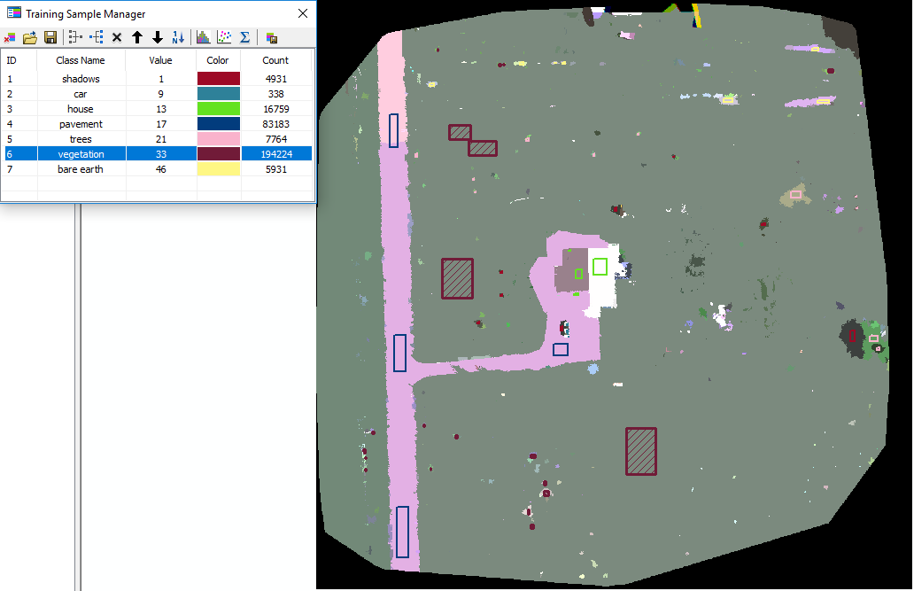 |
| Figure 3: Different samples input into the training sample manager. |
Once all of the samples have been added, the Classify Raster tool utilizes the training sample to apply the apply the surface classification to the imagery. After this is done, the surface types were combined based off of either pervious or impervious characteristics.
Results/ Discussions
RGB
The red, green, blue combination uses the visible light bands of the composite to create a RGB image of the visible light (Figure 4). As one can note, the road, and other areas of the surface look tinted red, which is a result of the un-calibrated sensor noted above. This image shows the distinct areas throughout the image. There is the house in the center, the road and driveway on the left side of the image, and dense vegetation on the right side of the image.
The red, green, blue combination uses the visible light bands of the composite to create a RGB image of the visible light (Figure 4). As one can note, the road, and other areas of the surface look tinted red, which is a result of the un-calibrated sensor noted above. This image shows the distinct areas throughout the image. There is the house in the center, the road and driveway on the left side of the image, and dense vegetation on the right side of the image.
 |
| Figure 4: RGB band combination shows imagery above. |
False Color IR
The false color infrared image uses a band combination of NIR, Red, and Green to create an image (Figure 5). This type of image is used to denote vegetation health. The healthier vegetation is a darker shade of red, and the impervious areas become a shade of blue. The map below shows how the vegetation surrounding the house is healthier than the vegetation further away. The trees to the east, and the shrubs to the north also appear to be healthy.
The false color infrared image uses a band combination of NIR, Red, and Green to create an image (Figure 5). This type of image is used to denote vegetation health. The healthier vegetation is a darker shade of red, and the impervious areas become a shade of blue. The map below shows how the vegetation surrounding the house is healthier than the vegetation further away. The trees to the east, and the shrubs to the north also appear to be healthy.
 |
| Figure 5: Map displaying the false color IR properties. |
False Color RE
The false color red edge image uses the following band combination: Red Edge, Red, Green. It is very similar to the fasle color IR in determining the vegetation health (Figure 6). It is also know as the NDVI. The colors of vegetation health are more dramatically different than the false color IR above, allowing users to see the differences in vegetation health much easier.
The false color red edge image uses the following band combination: Red Edge, Red, Green. It is very similar to the fasle color IR in determining the vegetation health (Figure 6). It is also know as the NDVI. The colors of vegetation health are more dramatically different than the false color IR above, allowing users to see the differences in vegetation health much easier.
 |
| Figure 6: Map displaying the red edge NDVI imagery of the study area. |
Surface Type
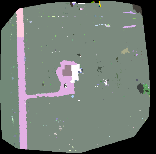
The surface type map displays the classified imagery throughout the whole study area (Figure 7). This is done before grouping these types together based on pervious or impervious properties.Seeing this, one can note that the uncalibrating of the sensor played a massive role in creating an inaccurate combination image. The field on the far west side of the image one can see in figures 4-6 is denoted as "House" in this image among other misclassifications.
The surface type map displays the classified imagery throughout the whole study area (Figure 7). This is done before grouping these types together based on pervious or impervious properties.Seeing this, one can note that the uncalibrating of the sensor played a massive role in creating an inaccurate combination image. The field on the far west side of the image one can see in figures 4-6 is denoted as "House" in this image among other misclassifications.
 |
| Figure 7: Map displaying the different surface types of the study area. |
Surface Properties
The last image displays the pervious and impervious surfaces throughout the study area (Figure 8). Pervious surfaces are any that can be penetrated by water and other liquids. This includes, grass, vegetation, and bare-ground. Impervious surfaces are any that do not allow water or other liquids to pass through. This includes things such as buildings, pavement, rocks, and metals. As noted before, there are inaccurate classifications, but aside from the western field and the house's western side, it paints a pretty good image of what the surface types of the area are.
The last image displays the pervious and impervious surfaces throughout the study area (Figure 8). Pervious surfaces are any that can be penetrated by water and other liquids. This includes, grass, vegetation, and bare-ground. Impervious surfaces are any that do not allow water or other liquids to pass through. This includes things such as buildings, pavement, rocks, and metals. As noted before, there are inaccurate classifications, but aside from the western field and the house's western side, it paints a pretty good image of what the surface types of the area are.
 |
| Figure 8: Map denoting the pervious and impervious surfaces of the study area in Fall Creek. |
Conclusion
Using value added data analysis on UAS imagery allows users
to gather results that demonstrate the robust usage of UAS data among various
professional fields.
No comments:
Post a Comment